| Getting your Trinity Audio player ready... |
“How many pages should have on a blogging website?”
What do you think is the ideal number for it? 2, 4, or perhaps 8.
When it comes to defining pages for a blogging website, many say that it shouldn’t have multiple pages, while others rely on their specific requirements.
Although both statements are true, you cannot overlook that a few pages are fundamental for every website, including blogging ones.
We are sure, just like every novice blog website owner; you might too be in a dilemma as to which pages should be included in your blogging website. But fret not! We are here to put an end to your confusion through this write-up that outlines 17 must-have pages for a blogging website.
Without further ado, let’s dive straight into it.
1. About Page
The About Us section refers to a page that includes details of your blogging website. You can also call it an introduction page which talks about who you are, when and why you started, the type of blogs you create, the purpose behind drafting them, and similar relevant details.
The About Us page is created with the idea of imparting information, sharing core values, and the journey of you and your website. If you are thinking of how an About Us page should look, you can consider checking out Seth Godin, an American writer and a pioneer in marketing. He talks about philosophy, books, tribes, respect, and of course, marketing.
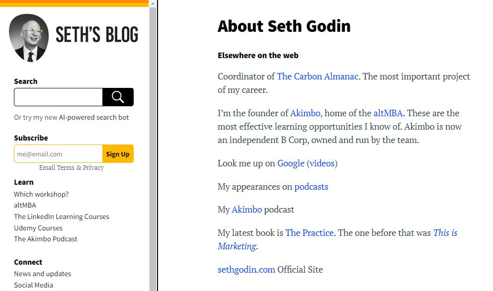
Like his blogs, the About Us page is equally interesting and delves into his history, profession, latest projects & books, awards & accolades, and where else you can read his work. He even has added his latest videos on the page for his readers to get redirected on the same.
Another wonderful example of an About Us page is Amit Agarwal, aka blogger and owner of Labnol, who writes blogs on technology and other softwares that can help readers and learners solve their queries instantly. His blogs mirror his personality and journey of becoming the father of Indian blogging.
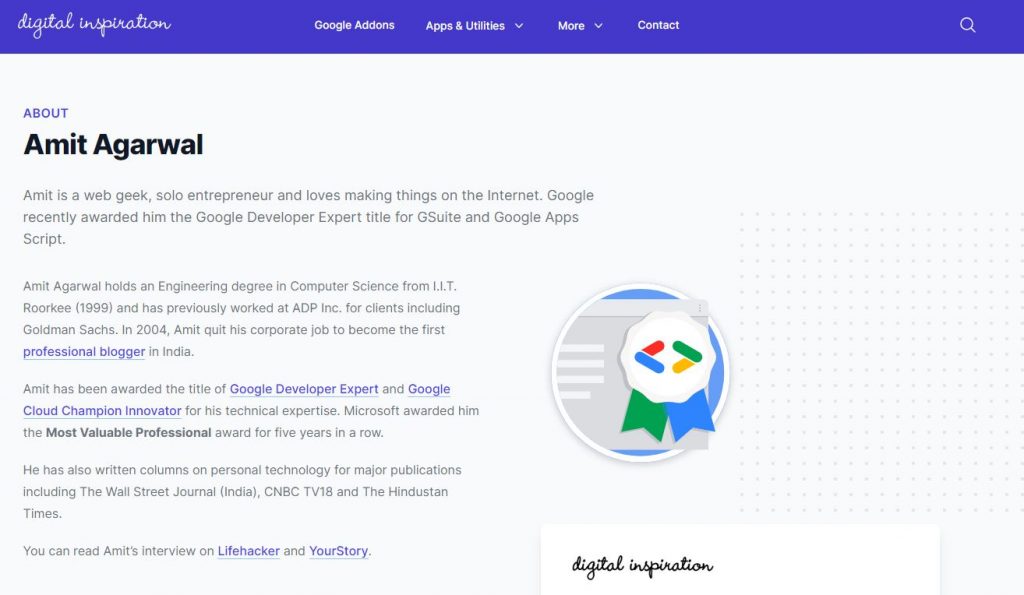
His About Us page showcases his past, business, blogs, and recognition for appearing on TV and radio shows such as CNN, IBN, BBC, CNBC, NDTV, and more. Like Seth Goin, Amit Agrawal also features the most recent videos on his About Us page.
Also Read: Is Starting A Blog Worth?
2. Contact Page
We all are familiar with the Contact page. This one page helps target readers to contact the author or take the desired action, like buying the products or contacting for collaboration.
The majority of the contact pages have details –
- The name of the site
- Phone number
- Email address
- Contact form
- Social media links
The idea of creating a dedicated contact page is to offer quick accessibility of the relevant information for readers to reach out to you.
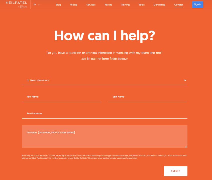
A classic example of a contact page is Neil Patel. His page is pretty straightforward to use, where you add important details as to why you want to connect with him, your name, email address, and message to offer an in-depth reason for reaching out to him.
You can also follow the simple contact page of YourStory, A website that posts blogs on startup stories and entrepreneurship in India.
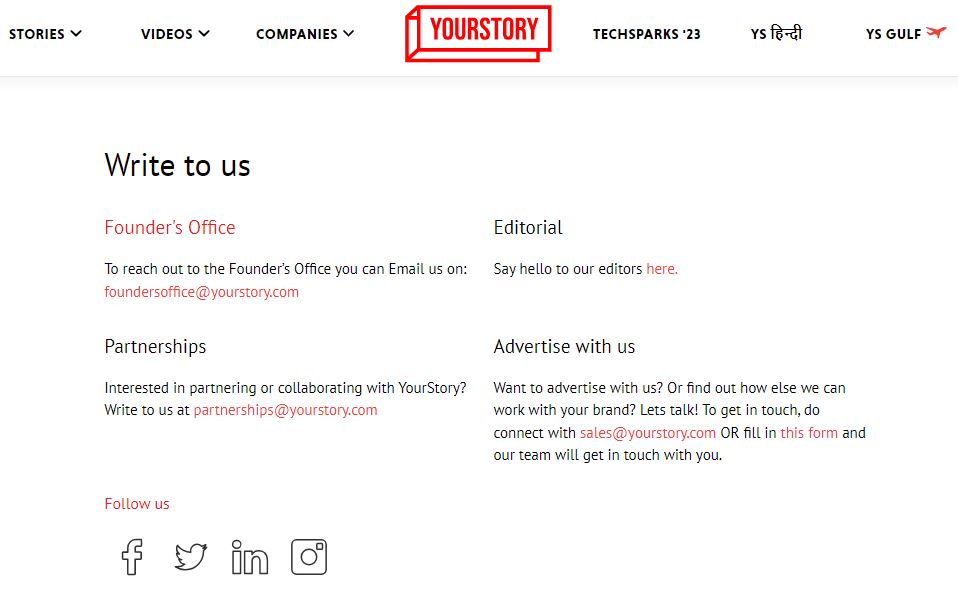
Their page is pretty informative and highlights details like their email address, office location, editorial, partnership, and advertising sections. The page also displays their relevant social links like Facebook, LinkedIn, Instagram, and Twitter.
Also Read: How Can You Make A Website Look More Professional?
3. Privacy Policy Page
Privacy is the main concern for visitors sharing their personal information and blogging website owners collecting shared information. Complying with privacy regulations not only ensures that gathered data is safe but also indicates how the complied information will be used and protected by the receivers, which in this case are blogging website owners.
Adding a privacy policy page on your website becomes mandatory if your blogging website also collects users’ information. Make sure it sheds light on which information is collected and why. It should also highlight data collection methods and how the data will be used, shared, and retained.
Your privacy policy page should also illustrate user rights, security measures in case of a breach, cookies & tracking technologies, and applicable laws. Don’t forget to mention the contact information, how often the policy will be updated, and lastly, the effective date upon every change.
Also Read: Best Practices To Secure Your Website
4. Terms of Service Page
The terms of service page generally focus on the rules and guidelines for the usage of your website by a visitor. You might be wondering why you even need a terms of service page. This page acts as a legal agreement between your website and visitors. Upon agreeing to the terms and conditions, users bind themselves to your websites, preventing you from facing legal disputes.
It also protects your IP rights when a user reviews or upload images, videos, testimonial, or any other content promoting your blogging website. Furthermore, it exhibits liability, disclaimers, termination of accounts, data & privacy, governing laws, community standards, monetization & advertising options, and frequent updates.
5. Getting Started
Getting started is like a 360-degree virtual tour of navigating your blogs. This page is for first-time readers and mostly emphasizes your featured content, topics you draft your content on, and tips to give an understanding of what your blogging website brings to the table and offer an optimal user experience.
Like other pages, this one as well has a CTA, encouraging visitors to subscribe, bookmark, or explore other specified categories. Many bloggers include testimonials, contact information, navigation links, and visual elements.
Consider checking out Problogger, a blogging website by Darren Rowse that shows how a user can seamlessly use the website.
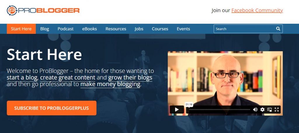
It has listed numerous resources on how to start blogging, recommends tools, and more.
Also Read: Best Content Management System Platform Optimized For SEO
6. Disclaimer Page
A disclaimer is added to clarify the limitations of your content. This page is extremely important for content-oriented websites, especially blogging websites. We know blogs are created to share information, opinions, guides, and advice, but they cannot replaced with professional guidance. This is why a disclaimer page must inform users that the information shared is purely to give you knowledge.
Let’s assume you are a blogger writing on skincare. You can have a disclaimer page stating that the write-ups shared are not a substitute for skincare advice by a medical.
Besides, providing a disclaimer of a particular blogging website is not offering medical advice from the professionals; it also talks about how the website owners make money through the affiliate links. Website owners offering products or services clearly state that they add the affiliate links on the Shop page.
So, every time an interested customer clicks on the link, the website owners get a pre-determined amount through the same. The ultimate reason for adding the links is monetization. Their idea is not only to promote the product/services/business but also to earn a commission upon each purchase, unlocking the growth opportunities for the advertiser and blogging website owner.
7. Subscribe Page
‘Thank you for subscribing. You will receive the latest updates on your email address every time we post and make an important announcement.” If you have subscribed to a website, you would have seen a popup showcasing a similar message.
This page is created to urge users to subscribe and become the first ones to receive fresh blog updates and enjoy the benefits that are not accessible for non-subscribers. Generally, this page is concise and shares straightforward content that stimulates users to click the subscribe button.
Once the users tap the subscribe button, they are shown a thank you page confirming their subscription, thanking them for becoming part of their community, and suggesting popular articles they should read until other articles go live.
8. Advertising Page
If you have been in the industry for a while, you might have heard about an ad-based business model where website owners allot and charge for a specific space to companies aiming to promote their products/business/services. The advertising page is included on the website when you plan to offer this opportunity to the potential bidders. Mention the ad types you will accept, their specifications, and rates. Be sure to show the bidding section if you intend to incorporate the same on your website.
If you want an idea for an advertising page, go through ScoopWhoop, a widely recognized Indian digital media company that features an ‘advertise with us’ section that is beyond the ads.

They promote brand stories that resonate with their culture and are interesting enough to be shared with others.
Also Read: How Is Ranking Different When Comparing PPC Vs SEO?
9. Sitemap or Archive Page
Regardless of the nature and number of pages on your website, having a sitemap is a must to ensure that a user doesn’t get lost in the maze. For instance, your site visitors are looking for a shopping page on your blogging website. Because of multiple pages, they are unable to locate the same.
Such issues can resolved by adding a sitemap on your website. Sitemap acts as a Google Map with all the information, including links to the pages, videos, images, etc., allowing you to determine the page’s location and redirect to the same with just a click.
Sounds simple, right? Well, it’s a breeze to use as well. Having a sitemap on your website not only ensures seamless navigation but also offers user satisfaction.
10. Custom 404 Page
“404,” The Page You Were Looking For, Does Not Exist.
You might have come across similar lines when going through websites. It’s a page created to shadow errors such as broken or non-existent links. When you create a custom 404 page for an error, it is a friendly message that assures visitors that they are on the right platform and should head back to the home page.
This also retains user engagement as users are notified rather than leaving them at the dead end. So, if you haven’t added a 404 page on your website; it’s time you do it now.
Since the entire page is plain with minimal information, you can make it intriguing by adding quirky elements or custom graphics and using humor. A fantastic example of this page is Medium.
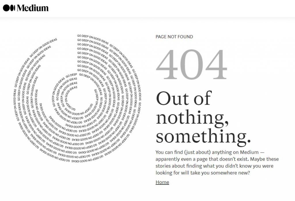
Both sites have playful illustrations, interesting graphics, and humorous yet straightforward content.
11. Resources Page
This page is essential for blog owners planning to list resources such as blogs, software, or other materials for site visitors. They are basically recommendations so that interested users can discover something new regarding which tools you use in your niche, what you recommend that saves the time & effort of searching everything manually.
In fact, the resources page also helps establish authority among your target audience, increase monetization opportunities, and enhance user engagement.
The best example of a resource page is Minimalist Baker, A food blogging website. They have mentioned each & every resource properly on the page in categories to make it helpful for the users.
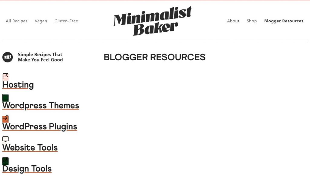
You must ensure to organize and categorize the references, pen down brief information about each resource, and don’t forget to include affiliate links if you have them. This will ease the page navigation and improve the site experience.
Also Read: What Should You Consider When Developing Website Content?
12. Review Policy Page
This page is ideal for bloggers aiming to review products, services, books, or other related things to make income and help users make the right purchase decision. You might be wondering that we are talking about conducting reviews when the title of the pointer says otherwise.
The review policy page highlights the guidelines, ethics, and procedures for sharing a review. A splendid example of a review policy page is The Verge. They have created a detailed and easy-to-understand page highlighting how they test, review, set the benchmark, scores, and list the remarks of the products.
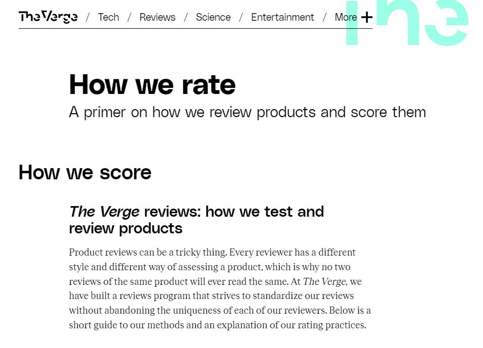
Now you might be wondering how adding this page can benefit me. Is it even necessary? Allow us to elucidate. This page is a must when you want to acquire the trust of your target audience and potential partners.
When you mention your review process, ethics, and commitment to transparency in analyzing a product, you foster confidence, leaving your viewers & future associates to form a long-term relationship with you.
13. Write for Us
This page is relevant to blogging website owners allowing other bloggers, marketers, or business owners to publish their blogs and providing a link to their blogs or websites so that they rank on search engines and improve their DA (Domain Authority) score.
This page states posting policies, the submission procedure, and other essential requirements. Ensure to draft clear instructions on the type of blog you will be accepting, what should be the format for the submissions, and how the articles will be reviewed. Don’t forget to outline how the guest authors and their social links will be promoted, and lastly, add your contact information.
14. Podcast Page
If you host a podcast and plan to integrate it with your blogging website, you need a podcast page. This dedicated page includes all the podcast episodes you have and will upload in the future.
An amazing blogging website offering a podcast page is Smart Passive Income, YourStory.
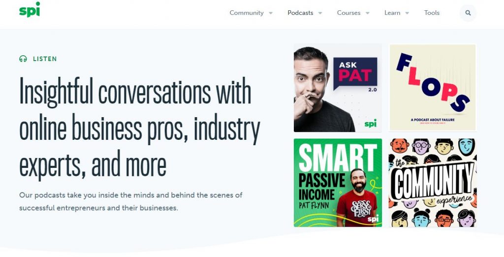
It also has notes of the show and relevant content, followed by the links to listen and subscribe to the podcast on other platforms.
Also Read: How To Organize The Content Of Your Website?
15. Freebies Page
Like the name suggests, this page has freebies, or you can also say free resources such as ebooks, templates, articles, or printables for the target audience.
A freebies page should only be included if you offer freebies. Many brands, such as Canva, offer quirky elements, templates, and more for users to create customized designs. However, many of them are not free. If users want to access them, they have to pay a certain amount to get the pro version. This is how they monetize.
Make sure to create and add freebies that are relevant to your target audience; otherwise, the chances of them downloading and using them will reduce.
If you want to know how a freebies page should be, consider checking out Melyssa Griffin’s website.
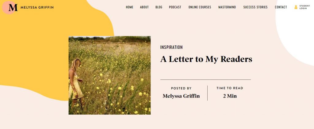
Be sure to include vivid descriptions and download links for the freebies. You can collect user email contacts by keeping an email sign-up for site visitors wishing to access the freebies & make them part of email marketing.
16. Shop Page
A Shop page is necessary for blogging website owners selling products, offering services, merchandise, or digital goods. This is, again, an excellent way of monetization, expanding your brand, and showcasing expertise while keeping your audience engaged.
You can sell products according to your niche, but they should interest your users to generate revenue. When creating a shop page, you must add high-quality images of the offerings, brief yet informative descriptions, prices, and use a secure checkout system.
I am Styl-ish by Tiffany is one of the finest examples offering a Shop page.

This was all about which pages a blog should have. Now let’s talk about certain pages that help visitors and blog owners.
Also Read: How Much Does It Cost To Start A Blog?
Why These Pages Benefit Readers and the Blog Owners
One of the biggest myths about blog websites is that they are only created to help readers provide information on certain topics. However, that’s not only the reason. There are a few pages, such as the ones we mentioned above, that benefit site visitors as well as blog owners.
These pages are a medium to enhance user experience while achieving a goal set forth by the blogging website owner. Let’s give you an example – The home page, product page, and about page are created to ease up the overall navigation process for users and provide the content or details they are looking for.
However, that’s not it. These pages also help in improving user engagement and SEO rankings. Ask how? When you draft and categorize the content effectively, it signals search engines that your pages offer a positive experience to users, which improves your ranking on SERPs.
Furthermore, such pages also help you establish authority, open monetization opportunities, gain insights into your target audience, and increase branding possibilities by creating a cohesive website look.
Continuing with the example of About Us. When you showcase your expertise and experience in the About section, users get an in-depth understanding of your blogging website, enhancing credibility and increasing user retention.
Other pages, such as Services, not only help you promote but pave the way for revenue generation. Through the contact forms and comment section, you learn more about your target audience & target market, allowing you to create a personalized experience for every site visitor.
All in all, attaching certain pages is crucial for users and blog owners to ensure the long-term success of the blogging website.
Frequently Asked Questions
The home page of a blogging website should highlight the overall aspects of a website, including what the website is about, types of blogs, newsletter sign-up, featured products or services, freebies section, popular trending posts, contact information & CTA, and most importantly a search bar to offer an optimal experience.
A dedicated contact helps users to reach out and welcomes partners & collaborators to initiate contact with you. Moreover, it creates a sense of professionalism, allowing you to build trust and forge relationships.
Integrating a search bar offers navigational convenience, allowing users to find a desired page without a hitch, resulting in enhanced user experience.
When a user writes their relevant queries, you can include them on the FAQ page and answer them, which will not only solve their concern but also shows that you value them, leading to user engagement.
If your blogging website collects user information, yes, adding a privacy policy and terms of services pages is a must to give an idea of how the gathered data will be used and who can access it. Incorporating these pages shows professionalism, builds trust, and acts as legal protection.
To Sum Up
We hope this blog gave you a better understanding of choosing the relevant pages for your blogging website. Maintain a cohesive look, offer a smooth browsing journey, and structure the content & elements of the website to enrich users’ experience and ensure engagement.
