
| Getting your Trinity Audio player ready... |
Good website navigation is a key feature for any site, ensuring a positive user experience. Search engines like Google also favour sites with intuitive and clear navigation, which leads to higher ranking in search results and more traffic.
Navigation is important because it helps visitors quickly find the information they need. When a website follows good navigation practices, the user experience is smoother and more enjoyable, making it a crucial part of its strategy.
But what does that look like in action?
Let’s break it down!
What is Website Navigation & Its Importance?
Website navigation comprises tools that help visitors find content and features on a site, which is crucial to engaging users. These tools can include text, links, buttons, and menus. While guiding visitors from one page to another is a key goal, navigation also helps them understand how different pages on the site are connected.
Good site navigation leads to higher dwell times and lower bounce rates, especially for eCommerce and news websites.
Also Read: Is Making a Website Hard – Know the Truth
What is a Navigation Menu or Bar?
A navigation bar of any website or application is an organised set of links to internal pages on the landing page in a proper hierarchy. Usually, it’s located on any website’s header and footer section. There are different navigation menus for a website for various purposes and niches of your business.
Various Types of Website Navigation
1. Horizontal Navigation Menu
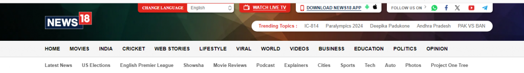
A horizontal navigation bar is a menu that spans across the top of a website. It usually displays a list of important links or categories in a single row. It’s one of the most common types of website navigation used by businesses.
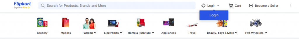
- eCommerce sites like Flipkart use a horizontal navigation bar to show product categories.
- Blogs or news websites often display horizontal menus with sections like ‘Home,’ ‘About,’ ‘Contact,’ and ‘Blog.’
♦ Common Uses of Horizontal Navigation Bars in Modern Web Design
- eCommerce websites to showcase product categories.
- Business websites organise primary sections like services, contact, and about.
- Blogs or informational sites for easy access to key pages.
➔ Weighing the Pros and Cons of Horizontal Navigation Bars
Pros:
- Clear and accessible: It’s placed at the top of the page so users can find it quickly.
- Organized: Keeps the layout clean and easy to scan.
- User-friendly: Visitors are familiar with this type of navigation, making it intuitive.
Cons:
- Limited space: If too many categories exist, the menu can look cluttered or not fit properly on smaller screens.
- Not ideal for mobile: It might not display well on mobile devices unless properly optimized or converted into a drop-down or hamburger menu.
Also Read: Industries That Need Websites the Most
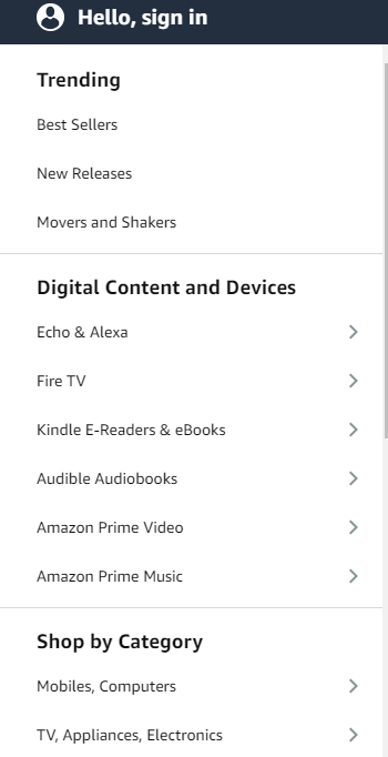
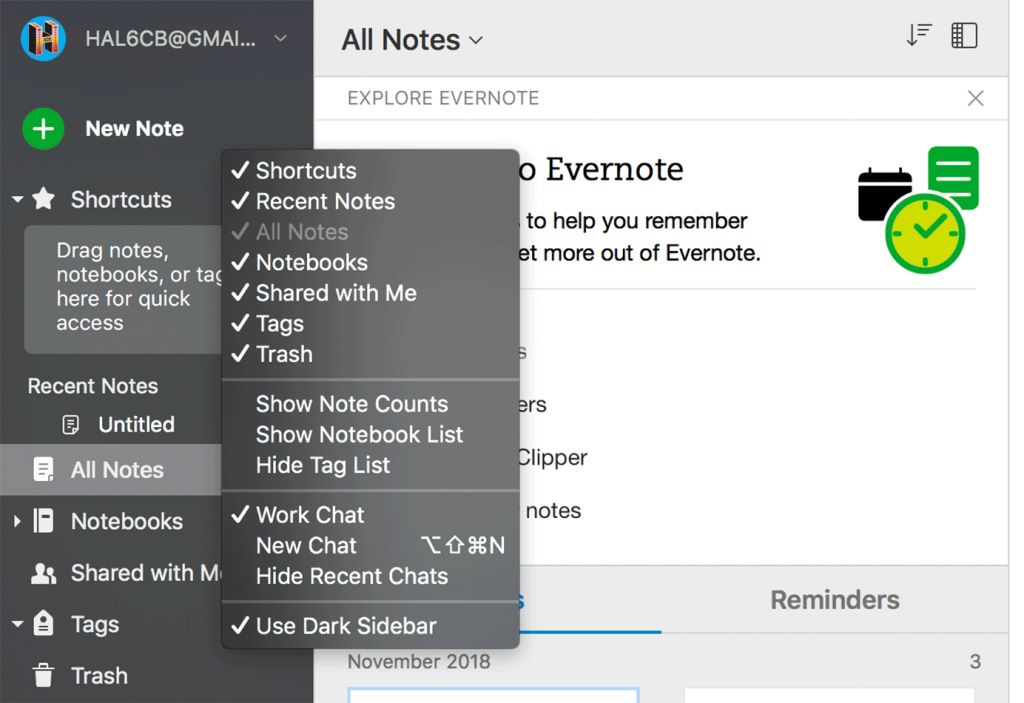
2. Vertical Sidebar Navigation
Vertical sidebar navigation is a menu that appears along the side of a webpage, usually on the left or right. It lists links vertically, providing easy access to multiple categories or sections.
♦ Real-World Examples of Vertical Sidebar Navigation
➢ Dropbox: Uses vertical navigation for file management.
➢ WordPress Dashboard: Organizes website management tools in a vertical sidebar.
Many eCommerce or blog sites use it to showcase recent posts or categories.
♦ Common Uses of Horizontal Navigation Bars in Modern Web Design
- For Dashboard Interfaces: Dashboard interfaces are often used in platforms like content management systems or admin panels, where users need access to many tools.
- eCommerce websites: Helpful for listing product categories, filters, or sorting options.
- Blogs and news sites: Often used for listing archives, categories, or links to related content.
➔ Weighing the Pros and Cons of Horizontal Navigation Bars
Pros:
- Ample space: Provides more room for links compared to horizontal navigation.
- Expandable: You can easily add submenus without cluttering the page.
- Good for content-heavy sites: Works well on websites that need to display many categories or options.
Cons:
- Limited visibility on mobile: Vertical sidebars can take up a lot of space on smaller screens unless collapsed or hidden.
- Takes up screen space: Reduces the available content area, especially on smaller monitors.
- Less familiar: Users may not be as accustomed to vertical navigation as to horizontal bars.
Also Read: Important Things Business Websites Should Have
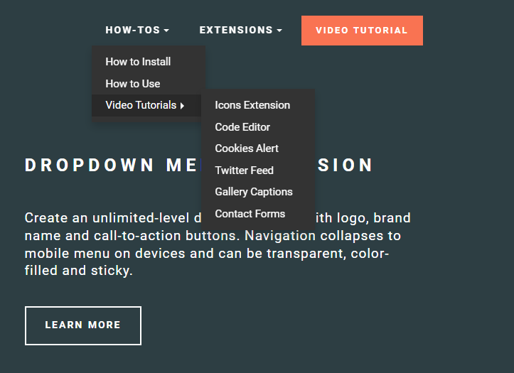
3. Dropdown Menus
A dropdown menu is a navigation element in which a list of options is hidden under a clickable or hoverable item. When a user clicks or hovers over a menu item, additional options “drop down”, allow them to select a specific page or category.
♦ Real-World Examples of Dropdown Menus
- Amazon: The ‘Shop by Department’ dropdown reveals different product categories.
- Apple: The main website menu includes dropdowns for iPhone, Mac, and iPad product lines.
- Facebook: Uses dropdowns in the user profile and settings section.
♦ Common Uses of Dropdown Menus in Modern Web Design
- eCommerce websites: To organize products by category, subcategory, or brand.
- Corporate websites: To display services, industries, and solutions in a structured manner.
Navigation bars are often used in header menus to provide users with easy access to various subpages without cluttering the main interface.
➔ Weighing the Pros and Cons of Dropdown Menus
Pros:
- Saves space: Dropdowns allow many navigation options without crowding the main interface.
- Improved organization: Helps structure large menus by grouping related items.
- User-friendly: Easy to use when implemented well, allowing users to navigate without multiple clicks.
Cons:
- Not mobile-friendly: Dropdown menus can be tricky to use on mobile devices if not optimized.
- Hidden options: Users might miss important links if they’re not immediately visible.
- Performance issues: Dropdown menus can become cumbersome or slow if poorly designed, especially with too many submenus.
Also Read: Which Functions are the Important on a Website?
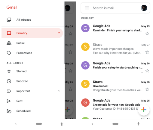
4. Hamburger Menu
A hamburger menu is a type of hidden navigation icon, usually represented by three stacked horizontal lines. When clicked or tapped, the menu expands to reveal additional navigation options or links. It is commonly used to save screen space, especially on mobile devices.
♦ Real-World Examples of Hamburger Menu
- The Facebook mobile app uses the hamburger menu to access settings, groups, events, and more.
- The YouTube mobile app menu hides categories like subscriptions, playlists, and watch history.
- Google Chrome browser or Gmail uses a hamburger menu to access settings, extensions, and tools.
♦ Common Uses of Hamburger Menu in Modern Web Design
- Mobile websites and apps: To save screen space while providing access to essential navigation options.
- Complex sites with many pages: used to organise many links into a compact, user-friendly format.
Websites with minimalistic designs are used to maintain a clean, uncluttered look while offering comprehensive navigation when needed.
➔ Weighing the Pros and Cons of Hamburger Menu
Pros:
- Saves space: Frees up space on smaller screens or minimalist designs by hiding menu options.
- User control: Users can choose when to open the menu, reducing visual clutter.
- Familiar icon: Widely recognized by users, making it intuitive.
Cons:
- Out of sight, out of mind: Important links can be overlooked if hidden in the menu.
- Extra click required: Users must take another step to access navigation, which may slow down their browsing experience.
- Not ideal for desktops: On larger screens, it can be seen as unnecessary or inefficient, as users expect visible navigation options.
Also Read: What Makes a Good Website Checklist? A Complete Guide
5. Footer Navigation
Footer navigation refers to the links or menus at a website’s bottom section. This navigation typically includes essential information, such as contact details, privacy policies, and secondary links that may not need to be prominently displayed at the top of the page.
♦ Real-World Examples of Footer Navigation
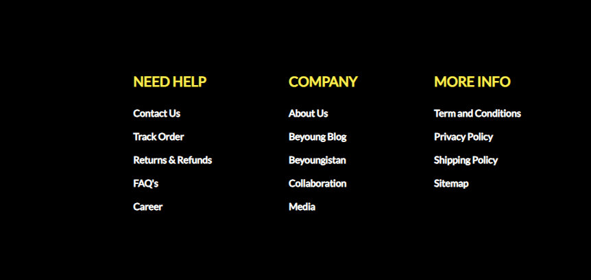
For example, the footer of the Netflix app or website contains links to the media centre, investor relations, terms of use, and help centre. The footer of the Microsoft website also includes links to support, privacy policies, and site maps.
♦ Common Uses of Footer Navigation in Modern Web Design
- Legal and policy information: The footer often includes privacy policies, terms of service, and disclaimers.
- Contact details: Email addresses, phone numbers, and physical addresses.
- Supplementary links: Categories like FAQs, careers, media inquiries, or blog pages.
- Social media links: Icons leading to the company’s social media accounts.
- Sitemap: A simplified website structure overview for easy navigation.
➔ Weighing the Pros and Cons of Footer Navigation
Pros:
- Less clutter at the top: Keeps the main navigation clean by moving secondary links to the bottom.
- Accessible from any page: The footer is available on all pages as a global element, making it easy to access essential links no matter where the user is.
- Improves SEO: Including internal links in the footer can help with SEO by reinforcing the site’s structure.
- Provides user trust elements: Legal information, privacy notices, and other trust-building links help users feel secure.
Cons:
- May be overlooked: Since it’s at the bottom, users may miss important links if they don’t scroll down.
- Not suitable for primary navigation: Key navigation links placed in the footer might be less visible or accessible, reducing the ease of use.
- Limited space for large menus: Trying to include too many links in a footer can overwhelm users and reduce clarity.
Also Read: How to Organize the Content of Your Website?
6. Mega Menus
A mega menu is a large dropdown menu that organizes links, categories, and subcategories in a grid.
♦ Real-World Examples of Mega Menus
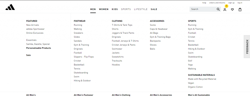
- Addidas: Displays product categories like sports, men’s, and women’s subcategories.
- Walmart: Organizes groceries, home goods, and tech with promotions.
- Best Buy: Lists product categories like laptops, TVs, and appliances.
♦ Common Uses of Mega Menus in Modern Web Design
- eCommerce: To display various product categories.
- News sites: To organize sections like politics, sports, and entertainment.
- Universities: To show departments, courses, and research areas.
➔ Weighing the Pros and Cons of Mega Menus
Pros:
- Organizes lots of content: Ideal for large sites with many categories.
- Easy navigation: Helps users find content quickly.
- Customizable: Can include images or promotions.
- Encourages exploration: Users might check out more areas of the site.
Cons:
- Unnecessary for small sites: Can create clutter.
- Challenging on mobile: Needs careful design for smaller screens.
- Can slow page load: Too many images or links can affect speed.
- Overwhelming: Too many choices may confuse users.
Also Read: What Pages Should A Blog Have?
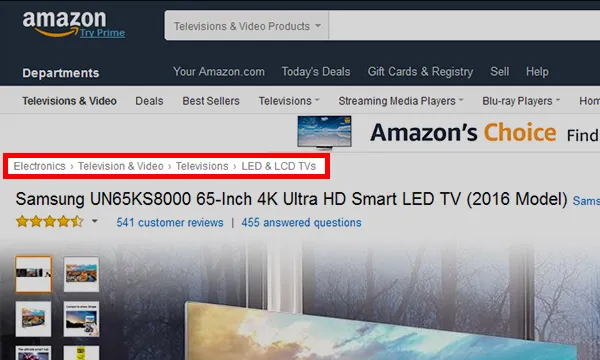
7. Breadcrumb Navigation
Breadcrumb navigation shows users their current location on a website and how they got there. It usually appears at the top of the page and displays links that let users go back to previous pages or sections.
♦ Real-World Examples of Breadcrumb Navigation
♦ Common Uses of Breadcrumb Navigation in Modern Web Design
- Amazon uses this to show the path from the homepage to a specific product category.
Home > Electronics > Laptops > Gaming Laptops
- Walmart helps users navigate from the homepage to a specific type of snack.
Home > Groceries > Snacks > Chips
- Travel or tourism websites use this navigation format to show the path from home page to flight/bus/hotel booking option to a specific city in any country.
Home > Hotel > International > UK > London
♦ Common Uses of Breadcrumb Navigation in Modern Web Design
- eCommerce Sites: Helps users move between product categories and subcategories.
- Blogs: Allows readers to see how posts are related and navigate through topics.
- Large Websites: Makes it easier to navigate complex sites with many pages.
➔ Weighing the Pros and Cons of Breadcrumb Navigation
Pros:
- Improves User Experience: It makes it easy for users to understand where they are and how to return to previous pages.
- Reduces Bounce Rates: This keeps users on the site longer by helping them find what they want.
- Boosts SEO: This helps search engines understand your site structure, which can improve search rankings.
- Saves Time: This lets users quickly return to earlier pages without starting over from the homepage.
Cons:
- Not Useful for Small Sites: This can be unnecessary for sites with just a few pages.
- Can Clutter Design: This may make the page look busy if not designed well.
- Relies on Clear Structure: Breadcrumbs work best with a well-organized site. If the site’s structure is confusing, it can be, too.
- Limited on Mobile: This can take up too much space on small screens, affecting the user experience.
Also Read: How Can You Make A Website Look More Professional?
8. Fixed Navigation
Fixed navigation stays in place as users scroll down a webpage. It remains visible at the screen’s top, bottom, or side, providing constant access to navigation links regardless of the user’s scroll position.
♦ Real-World Examples of Fixed Navigation
- Facebook: The navigation bar at the top of the page stays fixed while scrolling through your feed.
- Twitter: The side menu with trending topics and notifications remains visible as you scroll through tweets.
- Shopify: The cart icon and main navigation links stay fixed at the top of the page while shopping.
♦ Common Uses of Fixed Navigation in Modern Web Design
- eCommerce Sites: Ensures easy access to shopping cart and checkout pages while browsing products.
- News Websites: Keeps main sections like news, sports, and entertainment visible for quick access.
- Social Media Platforms: Provides constant access to profile settings, notifications, and other features.
➔ Weighing the Pros and Cons of Fixed Navigation
Pros:
- Improves Accessibility: Users can easily access navigation links without scrolling back to the top.
- Enhances User Experience: Keeps important links visible, which can improve site usability.
- Boosts Conversion Rates: Makes it easier for users to complete actions, like checking out or contacting support.
- Consistent Branding: Keeps branding elements like logos and menus visible, reinforcing brand identity.
Cons:
- Takes Up Screen Space: This can reduce the amount of visible content, especially on smaller screens.
- Can Be Distracting: Constantly visible navigation distracts users from the main content.
- May Affect Performance: It can increase page load times if not optimized correctly, especially on mobile devices.
- Design Challenges: This requires careful design to avoid interfering with the content and ensure it adapts well to different screen sizes.
Also Read: How You Can Find Fonts From Website?
9. Contextual Navigation
Contextual navigation is a type of navigation that provides links or options based on a website’s current content or activity. It tailors navigation to what the user is viewing or doing, making it more relevant.
♦ Real-World Examples of Contextual Navigation
- Amazon: Shows related products or categories when you view a specific item.
- Wikipedia: Offers links to articles relevant to the one you’re reading.
- Google Search: Displays related search queries and topics based on your current search.
♦ Common Uses of Contextual Navigation in Modern Web Design
- eCommerce Sites: Recommends similar products or categories based on what the user is browsing.
- Content Sites: Suggest related articles or topics relevant to the viewed content.
- Educational Platforms: Provides links to additional resources or courses related to the current study material.
➔ Weighing the Pros and Cons of Horizontal Navigation Bars
Pros:
- Enhances User Experience: Makes it easier for users to find related content or products.
- Increases Engagement: Encourages users to explore more pages or products, increasing site interaction.
- Personalised Navigation: Tailor’s options are based on user interests and behavior.
- Boosts Conversions: Helps users discover more relevant products or information, potentially increasing sales or actions.
Cons:
- Can Be Overwhelming: Too many links might clutter the page and confuse users.
- Requires Regular Updates: Needs ongoing maintenance to keep links relevant.
- May Distract Users: It might divert attention from the main content or primary actions.
- Complex to Implement: It can be difficult to set up, especially with dynamic or large amounts of content.
Also Read: How You Can Find Bugs in Websites Manually?
Best Practices for Website Navigation
1. Keep It Simple
Use a straightforward navigation structure to avoid overwhelming users. A simple menu helps visitors quickly find what they’re looking for without getting lost.
2. Maintain Consistency
Ensure the navigation layout and style are the same across all pages. Consistency helps users become familiar with your site and navigate it more easily.
3. Ensure Responsive Design
Design navigation to work well on all devices, from desktops to smartphones. A responsive menu adapts to different screen sizes, providing a seamless experience on any device.
4. Prioritize Important Links
Place key links, like contact information or top products, in prominent positions. This will make it easier for users to access important information quickly.
5. Clear and Descriptive Labels
Use straightforward and descriptive labels for menu items. Clear labels help users understand what each link offers and avoid confusion.
6. Limit the Number of Menu Items
Keep the number of main menu items to a manageable number. Too many options can be overwhelming; aim for 5-7 main items with sub-menus for additional links if needed.
7. Use Visual Cues
Incorporate design elements like arrows or icons to guide users. Visual cues help users understand navigation options and current locations within the site.
8. Avoid Deep Nesting
Limit the depth of menu categories to reduce excessive clicking. A shallow menu structure with broad categories and clear subcategories improves navigation efficiency.
9. Ensure Visual Design and Branding
Align navigation elements with your site’s overall visual style and branding. Consistent design reinforces your brand identity and makes navigation intuitive.
Also Read: Website Optimization Tips to Increase website performance

Get Backed by solid website hosting.
Conclusion
Effective website navigation helps users easily find their way around, enhancing their experience and satisfaction. To optimize navigation, use clear and straightforward labels, ensure responsiveness across all devices, choose easy-to-understand labels, and organize content logically.
Regularly update navigation to align with current trends and user needs for the best results.


